Decomposing Compositing — Key to Smooth Animations
In this article, we’ll embark on a journey to discover how to create smooth, high-performance animations on the web. We’ll explore how a webpage transforms into the image we see on our screen, how browsers animate elements on a page, and how we can leverage compositing to our advantage. So, without further ado, let’s dive in!
The Rendering Pipeline
Before we dive into what compositing is and how to use it to create smooth, performant animations, it’s helpful to take a step back and look at the bigger picture — how browsers even display an image on the screen in the first place.
To transform the code of a webpage into the picture we see, browser follows a series of steps known as the rendering pipeline. Let’s walk through these steps one by one, in the same order browser does, learning a bit about each along the way.
It’s important to note that the specifics of the rendering pipeline’s implementation can vary slightly between different browsers and rendering engines. However, for a general overview, those details aren’t critical.
Parsing and Style
Parsing and style computation aren’t actually a single step, but for our purposes, this detail isn’t crucial. What’s important is that, as a result of parsing and style computation, we obtain the DOM (Document Object Model) and CSSOM (CSS Object Model). Both of these models will be used in later steps of the rendering pipeline.
It’s worth mentioning that creating a new element on a page or modifying an existing one will require an update to the DOM. Depending on the changes made, this might cause the entire rendering pipeline to be triggered again. While browsers can often limit this process to only the affected part of the DOM, we’ll see later that our goal is to trigger as few steps in the rendering pipeline as possible. So, the fact that changing the DOM can trigger all other steps is something to keep in mind.
Similar situation with CSSOM: if elements style is modified in any way, the CSSOM will be updated — a process called style recalculation. Changing the CSSOM could trigger the entire rendering pipeline, but it can also only trigger some of it. Specific steps triggered depend on which properties were changed. We’ll look at how different properties affect the pipeline steps a bit further down.
Layout
Often referred to as reflow, especially for subsequent layouts (and Firefox seems to use this term instead of "layout" [1]). This is the step where the layout tree is constructed. The layout tree holds information about the geometry of all elements and is similar in structure to the DOM, though with some differences. For instance, if an element has display: none; applied, it stays in the DOM but won’t appear in the layout tree. Conversely, if you provide content to a pseudo-element, like ::before or ::after, it will be included in the layout tree. [2]
Changing an element's geometry — like its width, padding, or similar properties — will cause browser to recalculate part of the layout tree, or in some cases, the entire tree, since one element can impact the geometry or position of many others on the page.
Layout changes trigger all the following steps in the rendering pipeline. So, as you might imagine, changing the layout tree is best avoided whenever possible — or done mindfully when necessary.
Measuring an element from JavaScript typically forces a layout recalculation as well, and if done frequently or in a loop, it can lead to significant performance issues. You can learn more about this in the following list: What forces layout / reflow.
Check out these articles to learn more about layout:
Painting
Once the layout tree is created, we need to turn it into pixels, and this happens in the painting step. Browser walks the layout tree, generating painting instructions, which are then executed to produce an image, or rather a texture.
In computer graphics, an array of pixels (of any number of dimensions) is typically called a texture rather than an image. So, when referring to the result of rendering, we will call it a texture.
A page is typically divided into several layers, each painted separately, resulting in multiple textures. How browser chooses to split the page into layers isn’t crucial to understand yet, but we’ll explore it in more detail a bit later.
What’s essential to understand though is that painting is often the most computationally expensive step in the rendering pipeline [3]. While one might assume it would be fast since rendering can be offloaded to the GPU, that’s not always the case. Webpage content can be highly diverse — text, images, SVGs, videos, gradients, shadows — so there’s no single "silver bullet" rendering method. Browser might determine how to render specific layers on the spot, and in many cases, single-threaded algorithms do the job best [4]. As a result, painting typically consumes a large portion of main thread capacity relative to other steps. So, as with layout, our aim is to avoid it if possible.
To learn more about painting consider checking out:
Compositing
Now we arrive at the step that will be key to our success. By leveraging compositing, we can achieve impressive animations at an incredibly low computational cost. But before diving into that, let’s first explore what happens during the compositing step.
Once browser has painted the layers, all that’s left is to take all the rendered textures and slap them together into one final picture. Browser already has the relative layer positions from the layout tree, so it uses this information to handle compositing.
Here, we have a task that GPUs excel at, so browser can pass all textures to the GPU with minimal instructions on how to position them relative to each other, and the GPU composites them all at once. Additionally, compositing doesn’t need to be synchronous, browser uses a separate thread to manage this work [2:1]. This thread communicates with the GPU independently, keeping the main thread free.
But what’s important for us is that the instructions sent to the GPU include all transform properties, as well as opacity. These properties are ignored until this final step, where they can be applied in an extremely efficient manner on the GPU. So, if we change or animate these properties, browser only needs to perform the compositing step — no other costly steps required. And recompositing is dirt cheap, especially compared to the cost of repainting.
Articles to explore if you want to dive deeper into compositing:
Summary of The Pipeline
A key aspect of the rendering pipeline is that its steps are always sequential. If any change requires a layout update, you can bet that new paint and compositing work will also be required to reflect the changes in the final image. For animations, this process needs to happen at least 60 times per second — or on many contemporary devices with high-refresh screens, 120+ times per second — which adds up quickly.
Reflow and repaint occur on the main thread! The main thread is also executing other tasks, including, in many cases, the business logic of your application. If a script is running for a long enough time, and during that time reflow and/or repaint are needed, we’ll be forced to wait until the thread is free, which can result in dropped frames — or several. Compositing, however, doesn’t face this issue: it’s handled on a separate thread and computed on the GPU, so it doesn’t depend on the availability of the main thread.
That also means that CSS properties are not created equal when it comes to the computational cost of changing them[5].
- Properties that affect element’s geometry will trigger every step, starting from layout, such as
width,margin,display, and similar properties. - Properties like
colorandbackground-colordon’t trigger layout but still require a repaint. - And as we have already discovered, there are properties that require only recomposition:
transformandopacity.
You’re probably already guessing that transform and opacity will be our best allies in creating smooth animations — and you’d be guessing right.
Decomposing Compositing
So, what have we learned? The key to smooth, high-performance animations lies in leveraging compositing step. Let’s take a closer look at how this step works and how we can make the most of it.
In this section, I’ll share several examples inspired by Sergey Chikuyonok’s article, CSS GPU Animation: Doing It Right. I can’t recommend it enough — give it a read!
Compositing Layers
Let’s imagine we have a blank page with two elements on it. We’ll position them so that one element overlaps the other. So, our page will look something like this:
In the first image, we see the page as it would appear rendered in a browser. The second image provides an "exploded view" that visualizes the stacking order (essentially, the z-index).The HTML for this page might look something like this (exact styling isn’t crucial):
<head>
	<style>
		.element1,
		.element2 {
			width: 100px;
			height: 100px;
		}

		.element2 {
			position: absolute;
			top: 60px;
			left: 60px;
		}
	</style>
</head>
<body>
	<div class="element1">1</div>
	<div class="element2">2</div>
</body>
To render our page, browser will go through all the steps in the rendering pipeline: first parsing and style computation, then layout, followed by creating painting instructions. At this point, browser "notices" that the elements overlap. This isn’t an issue though because there’s a default stacking order, or we can define it explicitly using z-index, so browser knows which element to display on top. It will create painting instructions accordingly, with the second element in our example positioned above the first.
Here are a few resources to explore if you’d like to dig deeper into how stacking works:
After resolving the stacking order, browser paints the page. The result of this painting step is saved into a texture, known as a compositing layer. In our example, we have only one compositing layer, but as we continue, we’ll see what prompts browser to create multiple layers.
Once painting is complete, the layer is sent to the compositing thread, which instructs the GPU to "compose" it into the final image displayed on the screen.
Let’s visualize some of the steps we just covered. The first image represents the page after layout, with the stacking order visualized. The second image shows the painted compositing layers (single one in our example). The final image previews the page as it would appear in a browser.
Adding Motion
Now, let’s add some complexity and animate something — say, the second element — by moving it around with changes to its left property. This is a property which impacts geometry, and changing it each frame will force browser to redo some layout, repaint parts of the page, and recompose the result. While browsers have some optimizations to re-layout only certain parts and repaint mostly the changed areas, saving some work, it still won't be ideal. But let’s try it anyway and see how it goes.
In our visualization, we can see that the compositing layer is repainting continuously.
Let’s investigate the performance of this animation. To highlight any performance issues, we’ll run 10 identical animations at the same time with a 20x CPU slowdown, and we’ll limit the duration to one second for easier recording. When we take a recording in the Performance tab of Chrome DevTools, we see the following:
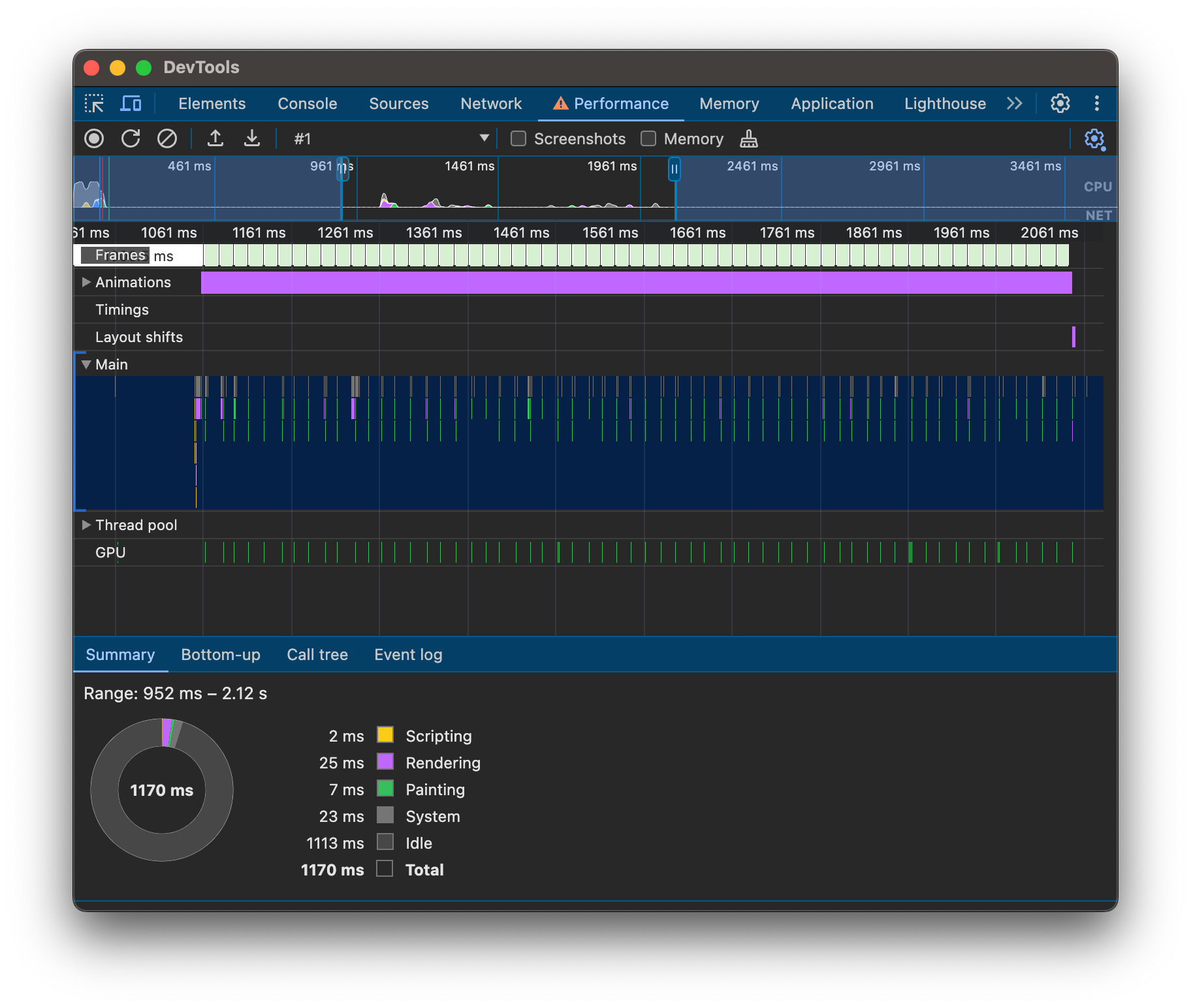
- Frames - each frame is indicated by a light green box.
- Animations - animations currently playing are shown as purple boxes.
- Main - shows tasks performed on the main thread.
It seems like a lot is happening on the main thread, with each burst of activity aligning with a "frame box". As we expected, browser is reflowing and repainting elements with each frame. Granted, a few milliseconds might not sound like much, and we can see that the main thread is mostly free. But remember, this is just 10 boxes moving on an otherwise empty page. On a real page, this could quickly become scary.
Composite Motion
But we can do better! We know now that compositing is cheap, and browser knows that too. Let's try animating the transform property instead of left, shall we? By changing only transform, we’re basically telling browser that all we want is some visual transformations — we won’t be interfering with layout, and there will be nothing requiring repainting. That allows browser to bring out the big guns: now it can just paint our page in two compositing layers and make the GPU do the rest. Moving element will be in a top layer, and the bottom layer - the rest of the page. Once layers are painted, transformations will be applied during compositing, and for subsequent frames compositing will be the only thing that needs to be re-done.
Let me reiterate to highlight how big of a deal this is. If we render the moving part of a page into a separate layer — layout and paint are required only once, instead of each frame! Transformations are applied in compositing on the separate compositing thread, meaning the main thread is free.
Here is our updated visualization, we now have two separate rendered layers.
Lets check how our performance tab is doing: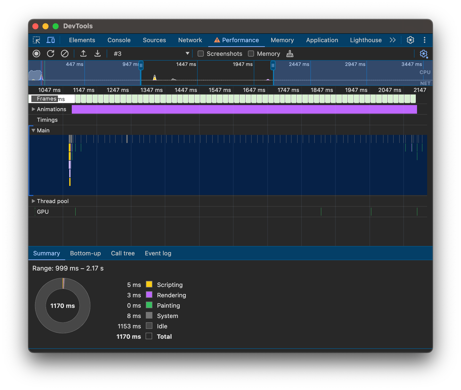
Cool, right? Let’s do all our animations this way and save a ton of work! Great idea, but as we’ve learned, not all properties are created equal. To keep animations isolated to compositing alone, the browser has to be completely sure that the properties we change won’t cause anything else on the page to respond to those changes.
And that’s why transform and opacity are essentially the only properties we can use for compositing animations. As soon as an animation changes other properties, we’re back to reflowing and repainting every frame.
Unexpected Layers
Now we know that browsers will split the page into layers when we create an animation that uses transform and/or opacity. However, there are cases where more compositing layers will be created, more than you might expect.
Imagine that in the earlier demo, we animate the first element rather than the second.
In this case, we see that, to keep the animation in compositing, the browser is forced to push the second element into a separate compositing layer as well, despite it having no properties that would explicitly move it to one. This is called implicit compositing.
Actually, there are many other reasons for an element to form a compositing layer as well. Some of them include:
- 3D transformation
translate3dtranslateZ
- Active animation or transition with
transformopacitybackdrop-filterfilter
- position
fixedsticky
backdrop-filterwill-changez-indexwith a negative value- if element is
<video><canvas><iframe>
For Chromium browsers, you can actually see a full list of reasons in the source code here: compositing_reasons.h
All of these reasons allow the browser to improve rendering performance in a similar way to how it improves the performance of our animation. For example, an element with position: fixed; would benefit from being in a separate layer, as the browser can composite it with the main page when scrolling occurs. Other reasons may be more subtle, but the principle is the same—reducing reflows and repaints.
You might have noticed that there is no mention of 2D transformation among the reasons for compositing. And yes, that’s correct — the browser will not create a new compositing layer for an element with static 2D transformations. This is because, unless it’s moving, there’s no benefit to splitting it into a separate layer.
Compositing - The Hidden Cost
And, of course, as the saying goes, there’s no free lunch — compositing comes with its own hidden cost. While compositing layers help browsers significantly optimize rendering, each layer consumes memory.
Layers are essentially images, and on the web, we’re used to highly compressed media. It’s not uncommon to have a Full HD image with a size below 100 KB. However, compositing layers are stored in memory as textures, which means they cannot be stored as JPEG or PNG files. Instead, they’re stored as an array of color values. And in case of a FullHD texture (assuming one byte per color) it would be 1920 * 1080 * 3 ≈ 6.2 MB.
In fact, it would be even more than that. There’s no straightforward way for the browser to know "at a glance" if a layer will need an opacity channel. So browsers simply store every layer with an opacity channel. Taking this into account, our Full HD layer becomes 1920 * 1080 * 4 ≈ 8.3 MB.
And that's just one layer. If our page includes many moving elements, items with fixed or sticky positioning, and when we consider implicit compositing, the video memory usage can easily reach hundreds of megabytes.
Many lower-end devices are quite limited on RAM and have shared memory between the GPU and CPU. For a browser running on such a device, a memory-hungry page might leave no choice but to drop some items from memory to avoid crashing browser entirely. On lower-end devices, you may have come across elements occasionally disappearing from the page or not rendering until a reflow occurs. This can be a sign that video memory is running low, prompting the browser to take action.
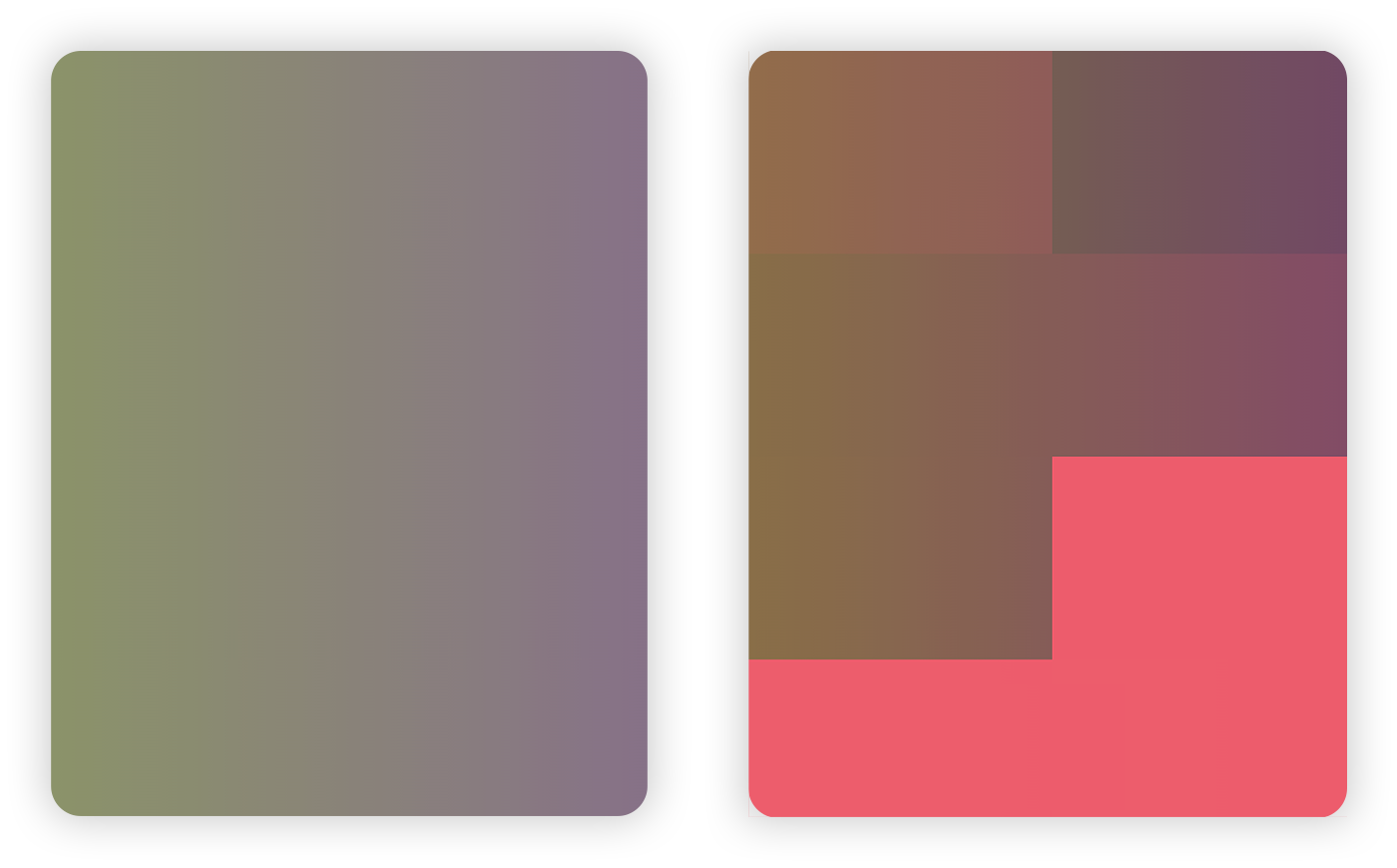
We can actually test this by intentionally overloading video RAM. I created a test with a transparent gradient that moves slightly using transform. In the first screenshot below, everything looks fine — the gradient is rendering correctly. But if we increase it to 1000 elements with gradients instead of just one, Chrome starts to struggle a lot. It’s no surprise — by my estimates, with the resolution of the window I’ve opened, it would require a whopping 30GB of video RAM! Many, probably most, of the compositing layers are either partially rendered or dropped from memory, as you can see in the second screenshot — those blocky artifacts should not be there, all gradients should be fullscreen. And just to note, I’m running this on an M3 Pro MacBook with no throttling.
Sure, 1000 full-screen layers might not be realistic, but a complex page can easily include several dozen layers. Lower-end devices will struggle to allocate enough resources to keep such a memory-hungry page running smoothly.
It’s important to remember that memory is a limited resource, and when explicitly creating a layer, we need to ensure the memory cost is justified. It’s also important to be mindful of implicit compositing, which can create a layer without us even noticing.
How To See Layers
To keep an eye on layers, we need a tool to view them, and most browsers provide one. Both Chrome and Safari have a layers tab in their developer tools. Personally, I find Safari’s tool easier to use, but you’re encouraged to try both and pick what suits you best.
I won’t go into detail on how to use each tool, as there’s already excellent information available. Here are a few guides worth exploring:
- CSS GPU Animation: Doing It Right | Browser Setup – basic information on both Safari and Chrome tools.
- Visualizing Layers in Web Inspector and Layers Tab – a quick guide to the Safari Layers Tab.
- Use Chrome DevTools to understand the layers in your app – a quick guide on analyzing layers in Chrome.
Addressing Some Misconceptions
You may have heard advice like, "Adding transform: translate3d(0,0,0) to an element will promote it to the GPU and boost performance." What is really happening: the element is forced to create its own compositing layer, which, on its own, doesn’t necessarily improve performance. In fact, it may have a negative effect, as the browser now has to repaint the original layer where this element was before separating. Additionally, memory usage will increase to store this new layer.
You may have also heard advice to "never use will-change: <something> unless as a last resort for improving performance." Now we have valuable context to understand why. Using will-change: transform will also force an element to create its own compositing layer. If the element is soon to be transformed, this might save the browser extra layout and repaint work, as the element would already be on its own compositing layer. Otherwise, it’s simply a waste of a compositing layer.
As you can see, you’re essentially providing extra "context" that this element might benefit from preemptively being in a separate compositing layer. But if you use this property without justification, it can cause more harm than good by spawning lots of unnecessary layers, similar to transform: translate3d(0,0,0).
A fantastic article on will-change is Layers and how to force them by Surma. Definitely worth a read!
To Conclude
Let’s distill what we’ve learned into a few key points to remember:
- Compositing is a powerful browser optimization that, when used correctly, is the key to incredibly efficient and smooth animations and transitions.
- Animation keyframes ideally should only modify
transformandopacity; the same goes for transitions. - Reflows and repaints are costly; avoid them whenever possible.
- Aim to create layouts and animations that minimize the number and size of compositing layers.
- Be mindful of layers that appear due to implicit compositing, designing your layout to prevent unnecessary implicit compositing.